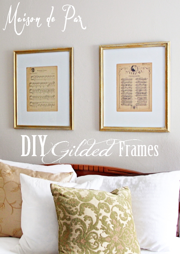
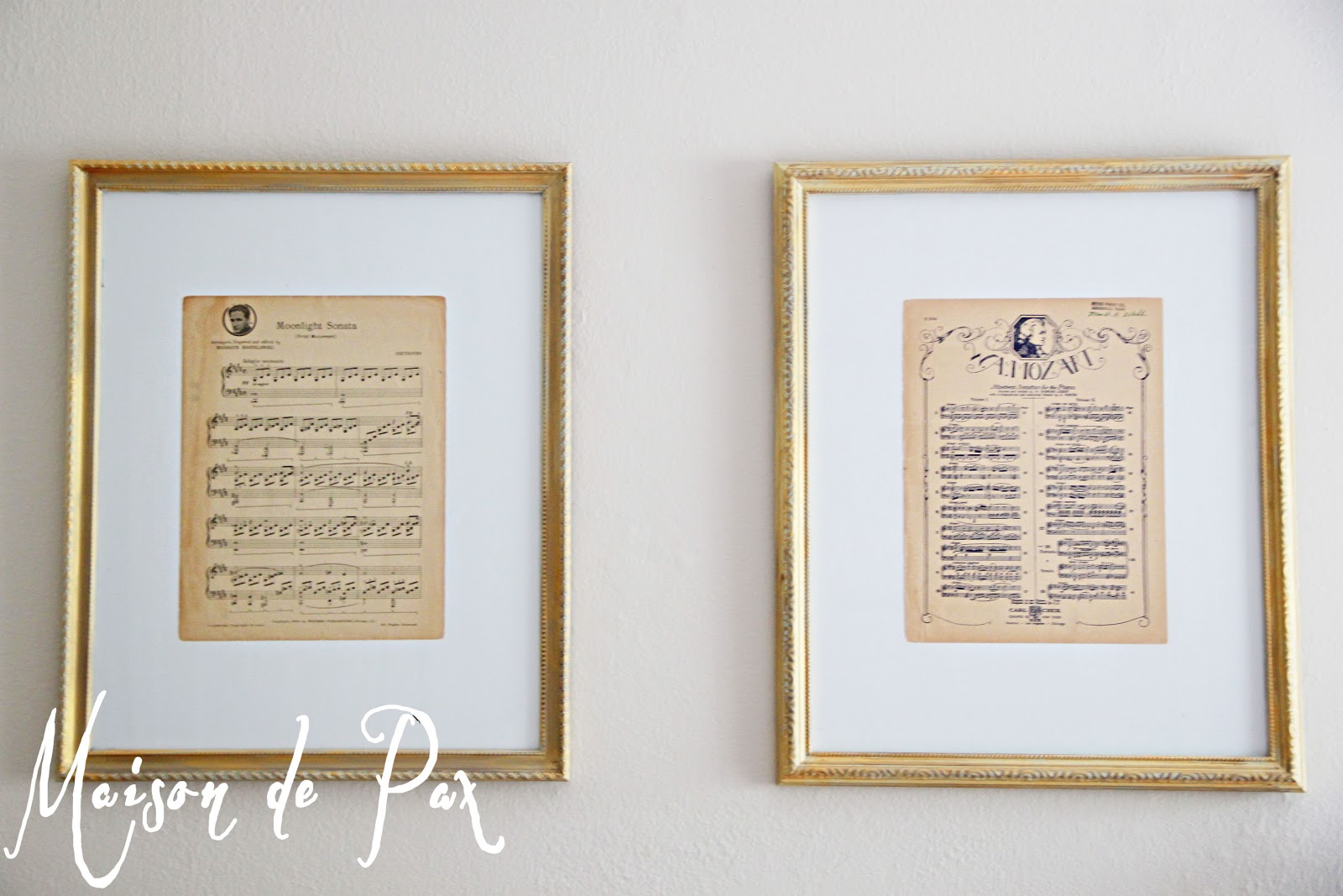
I am finally making some progress dressing the walls of my poor, naked guest room / nursery (full reveal coming soon!):
For some time, I’ve been planning to put two 16×20 frames above the bed, but I was lacking inspiration until I saw these on Restoration Hardware (as you can see from the crib and decoupaged antique map I did, I’m a fan of their stuff!). Aged sheet music seemed the perfect understated, neutral, soothing artwork for this space. I searched for some time for frames at thrift stores but was having trouble finding two the same size. What I really wanted was two frames with coordinating but not matching moldings (so they would be the same width but have different textures). I finally found what I was hunting, but the colors were all wrong:
Yes, one of them was already gold, but I really wanted a softer gold, something that felt lighter and airier, not so baroque. So I taped them off (because I’ve learned from experience that trying to remove the glass from cheap inexpensive frames for painting doesn’t often end well) and went to work. Here is a closer look at the before:
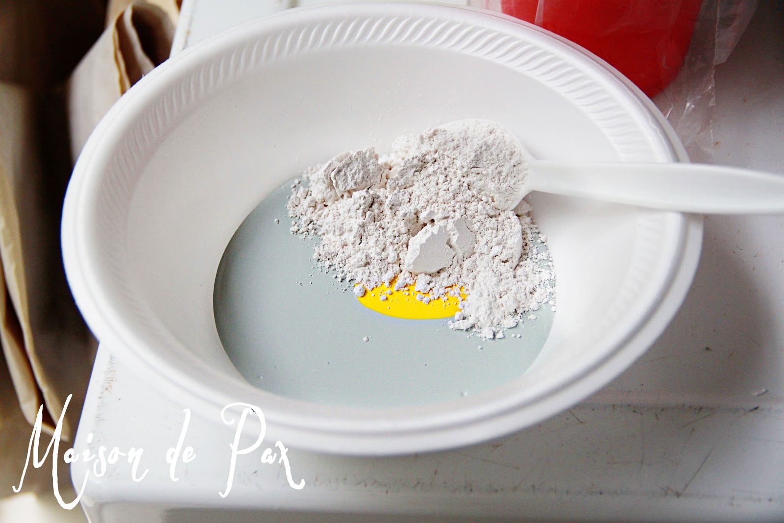
I mixed up some homemade chalk paint (read more about my methods here) using SW Copen Blue, some plaster of Paris, and a little yellow craft paint. I was going for a sea foam sort of color, and the Copen Blue was not quite green enough on its own.
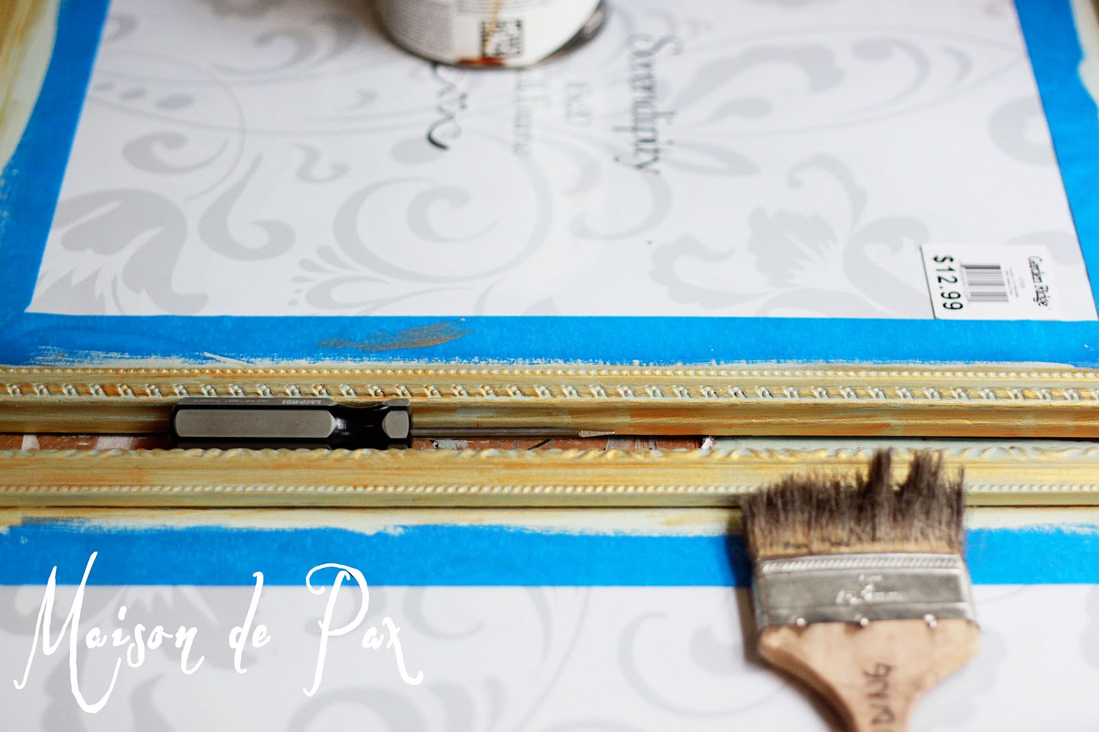
I chose to use chalk paint because the frames had a slick, plastic-y finish, and I wanted to be sure the paint would adhere. Both frames got two good coats of the pale blue-green, with an extra effort to get into the cracks and crevices:
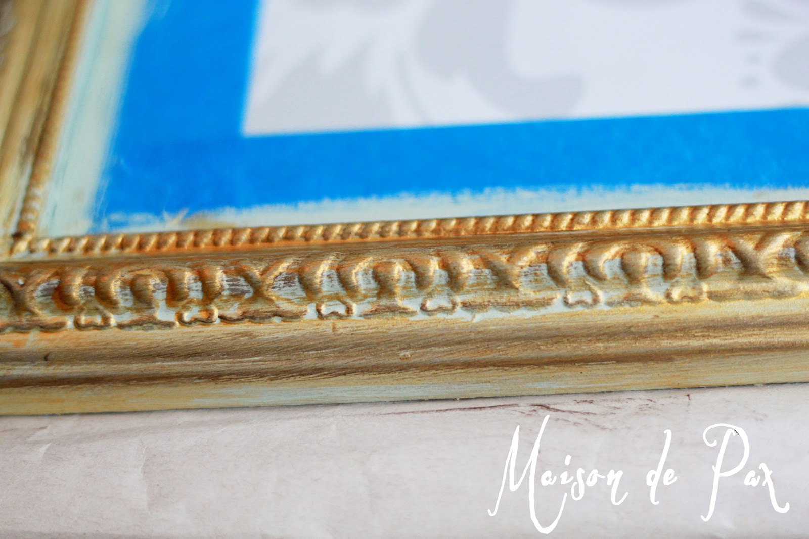
I then painted lightly (with zero effort to get into the cracks and crevices) over both frames with plain ol’ cheap gold craft paint. You can see how the pale blue-green peaks through:
I thought the result was a little too bright, so I followed up with some Rustoleum stain in Kona on a paper towel (just wiped on and rubbed off) to soften the shine a bit:
I finished with a very light brushing of Miss Mustard Seeds antiquing wax.
I then took a trip to my local thrift store to find some vintage sheet music. They have a section of music books, including a pile of loose pages that have fallen out of deteriorating books. In that pile, I found a beautiful page of Mozart’s sonatas from 1940 and the first page of Beethoven’s Moonlight Sonata from 1934. Even better, they gave them to me for free!
To save money (since I would have had to have custom mats cut), I simply turned over the papers that came in the frames and measured to center the sheet music on top. Since they’re above the bed, no one can get too close to them, so no one will ever know (except all of you that I just told!).
I am very pleased with how they turned out – just the subtle, elegant, soothing touch I wanted for that room… And the room is finally coming together. Come back soon to see the full reveal!
My husband gave me something similar for Christmas. I chose music that meant something to me. For example, a song from my wedding and a song I use to sing to my children when they were little.
So fun!


How pretty! I love the little touch of aqua on the frames….Christine
Thanks, Christine! I’m so glad you like them, and I’m so glad you came by!
These look wonderful. Thanks.
Thanks, Nancy! I really appreciate it. 🙂
LOVE the wall color — what is it?
Thanks so much! It’s Agreeable Gray by Sherwin Williams. 🙂
My husband gave me something similar for Christmas. I chose music that meant something to me. For example, a song from my wedding and a song I use to sing to my children when they were little.
So fun!
How wonderful, Angela! I hope you enjoy those sweet reminders. 🙂