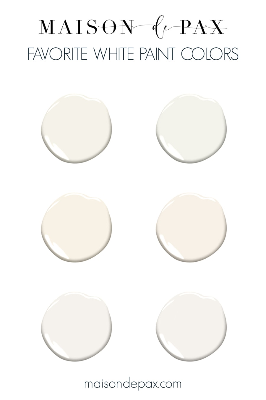
Best White Paint Colors for Any Home
Considering painting your house white? Whether for trim, cabinets, walls, or ceilings, these are the best white paint colors to consider for your home… or at least our favorites.
Choosing paint colors can be so tricky. Choosing the best white paint colors can be even more so.
Undertones, LRVs, north or south-facing rooms, and SO MANY options… How’s a girl to choose? Scroll on down if you just want the list of the best white paint colors, or continue reading for some background and guidance for choosing the right color for your space.
How to Choose a White Paint
First things first: white paint colors are not actually true white. To understand that, you’ll need to understand LRV.
Light Reflective Value
The Light Reflective Value or LRV of any paint is a number assigned based on how much light the color reflects, with 0 being absolute black and 100 being pure white. The higher the number, the more light is reflected.
No white paint actually has an LRV of 100, though. Sherwin Williams High Reflective White (which is one of the brightest paint whites you can get) is 93. Pretty much anything 80 or above is considered white, and “off whites” can hover from ~70-80. So you have to ask yourself how bright (LRV closer to 90) or soft white (LRV closer to 80) you want your white to be.
White Undertones
And speaking of “soft” whites, the less bright the white, the more added colors (aka undertones) to soften the bright white. An “off-white” paint has some added color to it:
- blue undertones – which gives you a “cool white”
- yellow tones – which gives you a “warm white”
- a mixture – which can leave you with a “neutral white”
So the question you have to ask is, which undertones are right for my space?
First, you have to consider style. Generally speaking, warm whites will help to create a cozy feeling, and they pair well with a more traditional space. Cooler whites, on the other hand, can lean more crisp and modern. These are generalizations, of course, but a good starting point if you know you prefer a more classic or more contemporary atmosphere.
Second, you have to consider the natural light of the room. North-facing rooms (in the Northern Hemisphere, at least) tend to have slightly cooler light, while south-facing rooms tend to have warmer light. So if your room is north-facing, you will want to choose a slightly warmer white paint to balance out the cooler natural light. And conversely for south-facing rooms.
East or west-facing rooms are tricky because the light quality will change in these rooms throughout the day, but suffice it to say that sunset light coming into west-facing rooms can often be orange or pink. It can also be tricky if the light coming into your home is filtered by lots of tree coverage or close buildings that might reflect their colors into your home.
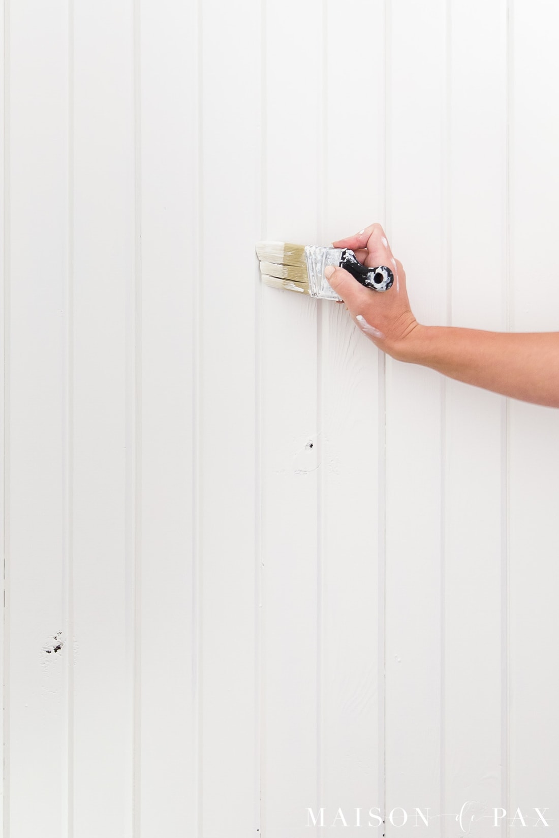
Finally, you have to try the color in the space. White paints are especially sensitive to the color of the light, flooring, and other elements in the space… So I always test 2-3 colors before committing. It’s worth the extra effort!
Want more tips on choosing a color? Sign up to receive my free guide below!
This post contains affiliate links. Click here to read my full disclosure.
How to test Paint Colors
As I said, testing your paint shade in your actual space, especially with whites, is so important. I’ve never had a problem with paint swatches all over my walls, but I realize that’s sometimes inconvenient. And due to challenges in getting paint samples these days, I am excited to share a better option.
Samplize will send you a reusable peel and stick sheet made with real paint. It allows you to move the sample around in the room to catch the different lights. I hope you find this tool as helpful as I have!
Get your peel and stick paint samples here.
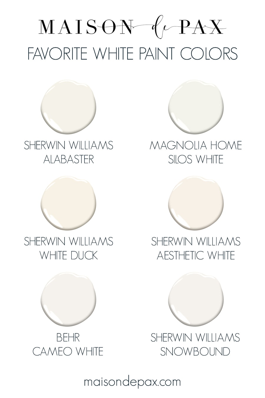
The best white paint colors
After years of painting my own homes and helping clients paint theirs, these have become my go-to white paint colors.
Sherwin Williams Alabaster
A (Slightly) Warm White
This is a go-to for many interior designers. It’s a soft timeless white (LRV 82) with a very subtle creaminess to it. But, unlike many creamy white paint colors, the undertones are more of a beige or greige rather than yellow. It creates a lovely, elegant space which still feels cozy. It’s got a lot of similarities to Benjamin Moore Swiss Coffee.
Update: see more about Alabaster here (with more pictures in real spaces!)
Magnolia Home Silos White
A (Slightly) Warm White
A very similar shade of white to Alabaster, but with a touch less yellow undertones (so little, honestly, that my husband swears they look the same 😉 ), Silos White is also beautiful and cozy without being too warm for a more contemporary or modern farmhouse style.
Update: see more Silos White throughout our ranch here.
Sherwin Williams White Duck
A (Slightly) Warm Off White
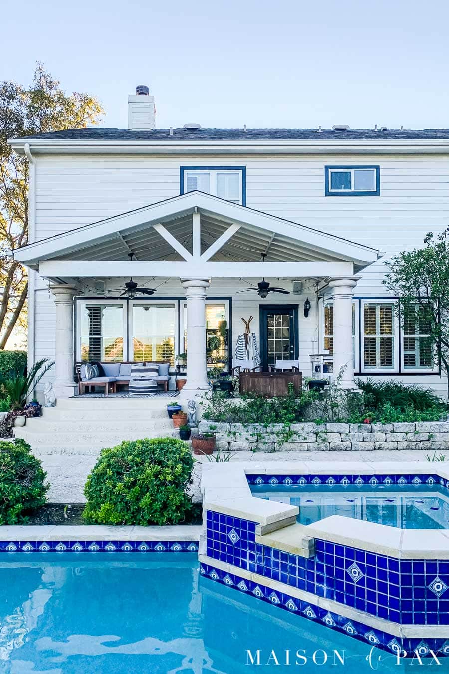
One of my favorite warm white paint colors, White Duck is a creamy and soft off white. It still leans beige in its undertones, rather than truly yellow, which makes for a solid warm neutral. With an LRV of 73, it is an excellent choice for exterior white paint colors because it doesn’t glare as much in the sun as something with a higher LRV would. Exterior paint colors, in general, read lighter than they do indoors. As an interior color, it reads darker than you see below but still soft and rich.
Update: see more of White Duck here.
Sherwin Williams Aesthetic White
A Neutral Off White
More gray than White Duck, Aesthetic White is an excellent choice if you want soft off white walls that don’t read warm. Aesthetic White is not cold either, though, it’s more of a true very very light greige, and an excellent choice if you have colored light coming into the space. For example, at our last home, our bedroom had only one window which faced a red brick house. Much of the light coming through that window was bouncing off the neighbor’s home and casting strange pink hues throughout the room. The off white absorbed enough light while the neutral undertones kept the room from looking pink or purple.
Behr Cameo White
A Neutral (or Slightly Cool) White
All the bedrooms and bathrooms in my home are Behr Cameo White – not sure I can give a better recommendation than that! 🙂 My favorite of the Behr white paint colors, it’s a lovely light light gray and blends especially well with Carrara marble (one of my favorite materials). It is not too cold, though, and reads as a soft true white with an LRV of 81.
Sherwin Williams Snowbound
A Neutral (or Slightly Cool) White
Extremely similar to Cameo White, Snowbound is on the cooler side and looks basically true, crisp white on the walls. With an LRV of 83, though, it is soft and elegant enough to let the furnishings and art work do the shining.
Update: see more about Snowbound here (with more pictures in real spaces!).
Other Lovely White Paints
A list like this wouldn’t be complete without a few honorable mentions. My other go-to Sherwin Williams white paint colors are definitely Sherwin-Williams Pure White (SW 7005) and Extra White (SW 7006).
Update: Read all about SW Extra White here.
Pure White, with an LRV of 84, is a little softer than Extra White, which has an LRV of 86. Pure White also has a touch more warmth. Both make excellent cabinetry and trim colors, though, and can either blend well with your white walls (for example: soft, Pure White trim with Alabaster walls) or provide a brighter contrast (for example, Extra White trim with Agreeable Gray walls). Read more about white trim paint (and sheen choices) here.
If you are searching for a bright white, then SW High Reflective White, Benjamin Moore Simply White, or Benjamin Moore Chantilly Lace are all good options. Simply White is a hint warmer than the other two, but with LRVs of 91-93, those three are some of the brightest options available.
Speaking of Benjamin Moore white paint colors, White Dove, with an LRV of 85, is similar to SW Pure White in brightness but is a bit warmer. And Decorator’s White has an LRV of 84 (fairly similar to SW Extra White) with a distinct cool flavor all its own.
Using White Paint
I hope you found this helpful! Have you tried any of these colors? Do you have another favorite? I’d love to know.


This is so helpful, because I’m considering painting. It is hard to know what to use, but this will guide me to better choices thank you.
So glad you found it helpful, Diana!
This is the first I’ve heard of LRVs. So helpful! Thanks for this thorough guide.
I’m so pleased you found it helpful, Anna!
Opps – correction on the color number for SW Pure White.
Pure White (SW 7005) and Extra White (SW 7006).
I found this article to be very informative. All the trim and kitchen cabinetry in my beach house is painted Extra White (SW 7006). Would I have made a different choice had I read this article first? Perhaps. But that said, I do love my kitchen. Definitely on the cool side as I have driftwood gray floors but I do think it all works well at the beach.
Oops – thanks for that catch! And I’m so glad you enjoyed the article, Lee Ann. It sounds like Extra White is probably lovely in your home.
Hello, and thank you for your recommendations! We are doing a renovation in our new to us home. I’m having trouble choosing my undertones. I want a true neutral light greige, a understated contrast between the trim and doors. I will include natural wood accents in the LVP flooring. I’m going with Cortec Calypso Oak. My couches are a warm grey. I’m trying to decide between aesthetic white or 50% accessible beige. We painted out ceilings, doors, and trim SW Extra White because it was a perfect match to the cabinets I chose. Would aesthetic white be a good choice with Extra white? Or not enough blue/grey undertones? Any suggestions?
Have you considered agreeable gray? It is a gentle greige, that you could lighten as well.
Thank you for this suggestion. I think Agreeable is a beautiful greige but I think too dark for our basement. Is it true that white heron is agreeable grey 50%? Or could I lighten agreeable 50%? Have you done this before, with Extra White trim and ceilings?
I’m not sure if White Heron is exactly 50% of AG, but I do know that most SW will mix up formulas for you at 50%, so that could be a great option! I have not used AG 50% with extra white trim and ceilings, but we have full strength AG with extra white trim and ceilings in our home (which has LOTS of natural light), and I love it!
What did you go with?
I actually went with Sherwin Williams’ Zurich White. It has a LRV of 76, so pretty light. I really like it!
I’m always happy to see the color and the explanation behind it with pictures! Thanks for sharing. My favorite white at the moment is SW creamy. It may have undergone a name change but it’s what I know it/bought it as a few years ago. It is like whipped cream after you put a few drops of vanilla. It’s my kitchen cabinet color and trim.
🙂 Nicole
Thanks for sharing, Nicole! Creamy is a lovely, soothing color, isn’t it?
Thank you so much for sharing your thoughts! We’re right in the middle of painting all our walls BM Swiss Coffee right now. We live in the Chicago area, so having a little warmth in the walls is helpful in these cloudy winter months. I’d love your opinon on something….Do I use the same color for the trim? I’ve read that a clean white-white can make Swiss Coffee look a little old and dingy. Who knew how tricky whites could be? Love, love, love your style!!!
Great question, Susan! Creamy walls with bright white trim can be tricky. I would consider either the same color for trim but in a different sheen (like they did in this beautiful home) or something at least a little softer/warmer than bright white (like SW Pure White). I hope this helps!
Wondering what “white” to use in a master bath, on the walls ( and possibly the vanity) when the ceramic tile (floor and tub surround) that it will be against, is more off-white with hunter green tile accents. I am afraid too white a shade on the walls will make the tile floors and tub surround look “dingy”instead of refreshed. The tiles are old, but homeowners do not want to replace.Any suggestions from your experience would be greatly appreciated. Thank you !
That’s a tough one! I would suggest starting with something that has a creamier base, like Alabaster or White Duck. Hold those up to the tile and see if it’s the right undertones. Hope this helps!
Hi,
I have a chair rail in my dining room. I am definitely going to paint the wall above the chair rail SW Rainwashed because I tested it in the room and love the color. I want to paint the wall below the chair rail white. Unfortunately, paint samples are unavailable right now in my area due to COVID, so I have to just choose a white. I was thinking of using SW Pure White. The trim in our house so far has been Behr Ultra Pure White (LRV: 94). Would it look bad to have SW Pure White on the wall with Behr Ultra Pure White trim? Would SW Pure White look dirty in comparison to the trim or okay? What color would you recommend with that Behr trim? My dining room has a NE window and a SE window. It gets the sun more so in the first half of the day. Thank you!
I’m sorry you’re having trouble getting samples! SW Pure White is softer and warmer than Behr Ultra Pure White… but it will probably look great since bright white trim tends to look crisp and clean. As with all whites, though, it’s hard to know for sure unless you can test it in the actual space (since lighting is key!).
I am having trouble picking a neutral white for saltillo tile floors and knotty alder doors. I want a warm white but no yellow under tones. What color would you suggest.
I’d probably recommend Chantilly Lace by Benjamin Moore!
Hi. This article was very helpful! If I were to pick SW snowbound for all the walls in my new house. What trim do you suggest to complement that?? Thanks!
Hi Julie, Pure White SW (in satin) complements Snowbound well.
We are repainting our entire house in Charleston. We made the decision to repaint ALL of the trim, doors, moldings and baseboards SW Pure White. My current dilemma is what to paint the walls. I was recommended to just paint them Pure White in Matte and let the walls dictate the color – however I am looking for the milkiest gray so subtle you could mistake it for a white. The floors are a dark brown/mocha color. Dilemmas after ready your posts but also your questions & feedback! Uhhhgh painting starts tomorrow!
Nothing like last minute decisions. 😉 I do think Pure White walls with Pure White trim looks great! But if you’d like to consider a darker white, you might try Pearly White or Incredible White. Egret White is a bit warmer but could be good, too, depending on your lighting. Another great option might be cutting Agreeable Gray by 50%. Playing with whites is tricky, so be sure to test them in your actual spaces before deciding. I hope this helps! Good luck!!
HI there- Love your blog! I’m looking at white paint colors for the first floor of our new to us (but an older) home. I’m liking Magnolia silos white and wondering what trim color(s) work with silos white? Would silos white be best as trim? We painted a small office on this floor with SW Silver Strand, with SW Pure White trim; I might have liked a bit warmer trim but it’s not bad. I wonder if SW pure white would make silos look more yellow or dingy and in general what trims color(s) would be good with silos white?
Thank you! We used Magnolia True White trim paint with our Silos White walls at the ranch house, and I like it! It allows the walls to look a little more creamy/gray against the brighter white trim. However, if you prefer your trim to blend more (rather than contrast the walls), then Pure White is a pretty good option: it’s similar to Silos White at 50% strength (picture half way between a true white and the softer white of Silos White). Finally, painting trim and walls the same color but in different sheens can also be beautiful! So if you love Silos White, you could consider using a semigloss on the trim and an eggshell on the walls. I hope this helps!
Thanks very much for your reply. I got a sample pot of the Kilz Silos White yesterday and it is just yellow–doesn’t even look like the swatch. Back to the drawing board!
Hi Jean, I’m sorry it didn’t work for you! It’s always a good idea to sample them in your home space.
Rachel, your blog is awesome and very informative. Can you share the flooring option that is in your parents home.
Hi Gail! I discuss all the flooring details including the color I chose at the bottom of this post: https://www.maisondepax.com/engineered-wood-flooring-for-the-home/
Thank you for this article. It was very informative! I am trying to pick a paint color for the living room , hall and foyer of our log house. The exterior walls, ceiling, trim and doors are wood (close to gunstock but my husband has had to mix stains to get one to match). The interior walls are drywall. There is very little natural light, we did recently have sky lights installed which helped some. The current paint color is brown teepee and we have decided we want a lighter color. Considering SW white duck, sohji white or natural choice. Or are there other warm off whites you would recommend? Thanks!!
Hi Lacey! Some other good warm white options are SW Alabaster, BM White Dove, and BM Chantilly Lace. With so little natural light, I’d lean whiter than warmer.
Hi Rachel, I just came across your blog and find your color and undertone knowledge to be refreshing and easy to understand. I have a dilemma with my updating project. I have custom cabinets painted SW Dover White in my great room. The walls are SW Whole Wheat and the ceiling and trim are Dover White. The front of my home has 20ft ceilings with mostly glass facing west. I was planning to paint the walls SW White Duck with SW Whitetail on the ceilings and trim. I hope this will cut some of the yellow tones from the cabinets down. There are times the Dover White looks like a nice white/cream paint in my room but other times I see too much yellow on the cabinets only. I was also going to paint my french doors (2 sets) SW Sealskin. Your thoughts?
Hi Deb! I am not familiar with some of those colors, but it sounds like you might want to explore an e-design service with me! Here’s where you can find the details: https://www.maisondepax.com/design-services/
Rachel, unfortunately, I am past that stage as we have bought all the paint. I just wanted an opinion of using Whitetail which is above Dover White on the paint strip with White Duck on the walls. I will most likely do a consultation with you when we get to the rest of the house in a few months. I do not like picking paint colors and have never had so much trouble picking paint and flooring in my life.
Dover White and Dovetail have yellow undertones, so I don’t think you’ll be able to erase them entirely, especially with west facing windows. However, the move from Whole Wheat to White Duck (which has more of a greige undertone) should cut down on the amount of yellow overall. Sealskin should be a lovely dark complement. All these whites are hard to determine for certain without looking at the exact space, but I hope this helps in some way.
Thanks, Rachel, I figured I need to stay with some of the same undertones of yellow but lighten the colors up.
Rachel, I just me across your blog. You’ve provided great info. I’m thinking of painting my open kitchen and family room in aesthetic white with sw pure white or bm simply white trim. The room faces west( lots of afternoon light). My only concern is my honey oak kitchen cabinets. Will aesthetic white work with the honey oak? What do you think? Thanks.
Aesthetic white does pull warmer so I think you are in good company! Always sample to be sure you like the combination.
Great article! I finally got my exterior paint choices down to 2 options Alabaster or White Duck. We just put both samples next to each other on both a shady and sunny side of our house. Alabaster is way too bright and White Duck looks dingy. Any thoughts on something right in the middle with maybe a lower LRV than Alabaster but not as greigy as White duck. I thought I was set…whites are so hard.
Whites can be hard with so much sun! Other white options are White Dove (BM) or Swiss Coffee (much warmer, but soft).
I have a red brick house that faces east so it gets bright sunlight in the morning. Currently the garage door and exterior trim are painted Sherwin Williams Decor White (SW 7559). which reads too yellow to my liking. I want a brighter, crisper white that reads white in the morning and not too dingy in the afternoon when there is no direct sunlight hitting the front of the house. I’m leaning towards one of the following 4 Sherwin Williams colors:
Sherwin Williams Westhighland White (SW 7566)…LRV of 86
Sherwin Wiliams Extra White (SW 7006)…LRV of 86.
Sherwin Wiliams Pure White (SW 7005)…LRV of 84.
Sherwin Williams Snowbound (SW 7004)…LRV of 83.
Which of the above colors would you recommend or would you recommend another shade of white to coordinate with the red brick?
Thank you.
Of that list, I would recommend Snowbound. It’s a beautiful white that doesn’t yellow. It’s also a great trim exterior color.
Rachel…Thank’s for your answer to my original question regarding best choice of 4 whites for trim/garage door on a red brick home getting full, direct morning sun. I now am thinking about Sherwin Williams Alabaster White (SW-7008)
What would be your choice for the trim and garage door on a red brick house that faces east (full sunlight in the morning). I want it to read white in full, direct morning sunlight and not dingy in the afternoon:
Sherwin Williams Alabaster (SW-7008)…LRV of 82 vs
Sherwin Williams Snowbound (SW-7004)…LRV of 83
I personally love Snowbound for trim and have seen it on a friend’s home—it’s a crisp white!
Hi! Would aesthetic white work in an open concept room with north and some south lighting? My cabinets in my kitchen are bright white Home Depot cabinets (maybe a light blue undertone) and the counters are typhoon ice laminate from Home Depot. My floors are pergo laminate with Auburn undertones.
If you could please help suggest some paint colors I’d really appreciate it. I’ve spent a lot on samples. 😞
I meant maybe a slight blue undertone. Not light. 🙂
Aesthetic White pulls warm and it sounds like you have a lot of cooler blues in your kitchen. I might recommend a more neutral/grayish white, like Snowbound and Decorator’s white so that the warmer whites don’t look yellow.
Hi! Thank you so much for responding! My cabinets I’d say are maybe slightly cooler white since I see blue at times, but the counters have a yellow cream, griege , and a blue gray so wasn’t sure which route to go. Flooring and furniture are warm. But then there is the northern light.
Thank you so much!
Hi! In that case, I’d go for the undertone you want to have—but stay as neutral as you can. Snowbound is a good neutral white that could blend well.
Hi there! I just found your blog and am loving it all, not just the paint color master class 😉
We are renovating a couple bathrooms and have decided to repaint all the trim/doors/built-ins as well. We have Repose Grey throughout the downstairs, stairwell, and upstairs hall. I run into trouble because we have a different color in each of the other bedrooms/baths/living areas upstairs and a lot of creams throughout the house to go with the antique white of the current trim/doors/built-ins. I have been carrying around SW 7004 Snowbound, SW 7005 Pure White and SW 7008 Alabaster, looking at them in all the rooms keeping in mind wall color, natural light, artificial light and furniture, tile and flooring. Depending on the room, Snowbound reads pink and Alabaster reads yellow. Pure White seems to respond as the most neutral in the most spaces, but I am concerned it will be too bright and stark, especially since I wanted to use the trim color as the wall color in the bathroom renos. Am I asking too much of a single trim color or is there a goldilocks option. Thanks so much!
Hi Meg! It sounds like you are leaning Pure White which you like in the space. Try painting a larger area with that color and see if you feel like it’s too stark. I think that it’s great that you know that Alabaster and Snowbound may not be fits for you with pink/yellow tones.
Hi,
Just came across your article…I call whites a field of nightmares 🙁 I need to paint my whole open concept house and have literally been struggling for a year…My house sits oddly with the biggest windows along the back of the house in the middle of a North-Eastern direction. (so not North or East- and heavy on the pine trees.
I have bought several stick on samples and I still can’t figure it out…I was thinking behr polar bear- tried that in an entry/mudroom it looked ok if not a tad stark- but 4 feet into the kitchen it started pulling a weird creamy greenish color….maybe it is has too high of an LRV? Definitely want to brighten up my space- but have to stay away from cool/blues/grays as Montana can be cold and dark. Obviously need something neutral to barely warm, not creamy/yellow- but not so white it looks florescent when the sun does come out …. :/
Do you have any “magic” color suggestions?
I think Snowbound could be a good fit for you! It doesn’t read yellow or blue and is cleanly neutral.
I am looking for a white paint by Sherwin Williams for the exterior of my modern farmhouse in SC. It faces West, has black framed windows, doors & black metal roof. I was leaning toward Pure White 7005 but worried it will be too stark? Just don’t want anything with yellow, pink, green, blue, etc undertones. Any suggestions?
I’d really love for you to check out SW Snowbound for that application. It’s a fresh white with no pink/yellow overtones.
I have so enjoyed reading your blog—very informative!! I am stuck in the off-white dilemma! I need a Sherwin Williams paint for my bedroom with windows that face North-East & end up South! I have light reddish oak floors, an oriental rug with magenta red, teal & navy and reddish/brown traditional furniture. I lean toward wanting to keep walls cozy since it is a bedroom but since we added a king bed, it made my room shrink! Is there any hope?
Your furniture sounds like it’s leaning warmer with the red tones, so you want to avoid blueish/cool tones in your paint. The warmth of the light from the South will also warm it up. I’d stick with a neutral off-white, because you both don’t want it to be too warm or cool. Aesthetic white might be a good choice for you!
What white paint would you pair with SIlestone eternal statuario and seaside 3×12 white subway tile? We are building and would love to have a versatile white but I feel like the subway tile and the counters are going to really dictate the white we need. I’m leaning toward SW Extra White but do you think Snowbound or another option would be more flexible?
Snowbound looks great in all environments, even cool. It is very neutral, but I always recommend sampling before making the commitment.
Hi there,
I’m truly torn on what to paint our master bedroom. Currently it’s a Smokey purple and I’d like to create a more neutral and natural feeling space. I was thinking extra white trim and ceiling but not sure which is the best color for walls…any suggestions?
Also, is extra white ok for trim and ceiling throughout the house if I have mostly beige walls but accent walls of amalfi and sage?
Thank you!!
Beiges can really vary from brown to purple tones, so I’d try one room with Extra White to see what you think! For your bedroom space, how about a warm white like SW Alabaster for a warm soothing white?
Thank you!!
Hi. Wondering what you think of High Reflective White, Sherwin Williams. Planning on using it for walls and trim, different finishes, in a small north facing family room with 2 side by side windows.
I think that is a nice white trim color, though I have never used it in my home. In a north facing room, I would definitely sample it to make sure it doesn’t feel to ‘cold’ or blue.
Well, I went with the High Reflective White for my walls and trim, satin and semi-gloss, and absolutely love it. It’s a beautiful, clean, but not cold or sterile white. I didn’t mention in my first post that it was recommended by a color consultant and I was a little hesitant after reading some reviews about how white it is and how it can require more coats than other whites. It did require more coats but the end result is perfect in my space. Thank- you.
I am so glad you love the final result Kathy!
Hola, quiero pintar mi casa con un blanco cálido, tengo techos de madera,piso de madera y poca luz en general. Que color me recomendarías? Gracias me encanta tu estilo.
So happy I found your blog as I went down the rabbit hole if white paint colors! We picked an all over color (SW Eider White) without being able to sample due to timing of our move. Our walls now look blue and I cannot unsee it. Our trim is very creamy but I got a sample of aesthetic white and am leaning towards that now. Worried we will pay to have it repainted and again I will see blue. I am not seeing it with the sample but is this a possibility?
That’s a tough one, Andrea! As I shared, Aesthetic White was the solution to removing the lavender tones we were getting in our master bedroom, and it was paired with very creamy trim in that home, as well. So it’s a great place to start! I can’t promise it will work, but I do think that it has great hope. Can you try the sample in several places to give yourself a better chance of confirming your decision?
What is a good neutral white cream that goes with a blush color?
It depends on the blush color, but I like Alabaster as a creamy white.
Hi Rachel,
your articles have been very inspiring as well as leaving with me more questions 🙂
I am struggling with pulling everything together with wall colors. We are mirroring your remodel you did with your parents with the kitchen kraft dover white and rustic maple. We are going with similar counter tops but a slightly different back splash (a stone finish vs the marble finish). The backsplash we are using is called diana royal split face slides marble mosiac. It is a lighter/whiter with some every so slightly grey tones/veins to it (PS i’m horrible explaining colors so sorry about this).
My problem is this – the kitchen/living room is open concept with 16+ feet ceiling (we are going to do tongue and groove in a color similar to the husk rustic maple cabinets) and the flooring is an oak that has variations of dusty pale browns with hints of softer golden hues.
I am stuck between picking between snowbound, alabaster and aesthetic white. The room faces the south and west lighting — we are in florida and it is a harsh sunset (we love it by the way)- however I DO NOT WANT ANY YELLOW. I have put the samples on the walls and love the aesthetic white, however it feels really dark on the walls (and after painting all of the walls I am worried it will feel more cramped and less light and airy feeling. I love the snowbound but it feels so white (and there is currently no flooring or anything on the ceilings or flooring to help me determine what colors these walls will eventually reflect). I am sure once I have flooring and cabinets and furniture it will feel different, but initially it feels very white. The Alabaster is beautiful on the wall- Im just afraid it will end up pulling to yellow because I am already seeing hints of the warmth coming through and I am worried that when I do the entire will it will be to warm. I have all 3 side by side and loving the aesthetic white- just worried that when I put it on all of the walls it will end up making the room feel dark and I love natural light, light colors — just really do not want to be pulling any yellow or warm.
Any recommendations would be SUPER APPRECIATED 😛
thank you
I think with all that you described, I am leaning Snowbound. Alabaster is going to warm up with that western sun. Snowbound will feel more inviting with furnishings, etc.
Which trim color do you think will pull less yellow from my freshly painted SW Alabaster walls…BM Simply White or SW Pure White. I do not want to do Alabaster trim b/c I’ll be limited with paint colors in the future. THANKS!!!
I usually love the combo of SW Pure White trim with Alabaster walls. I would check samples in your own space (because it’s amazing how lighting can affect white paint!), but it’s usually a great combo. I hope this helps!
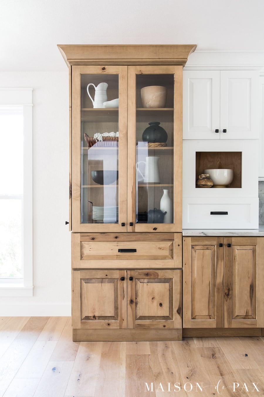
What color stain did you use on the wood lower, it looks so natural and what white color on the upper kitchen cabinets.
They are a custom stain with Kraft Maid cabinets! You can get all the details here: https://www.maisondepax.com/white-and-wood-kitchen-reveal-part-1-cabinets/
Thank you for being so helpful! What do you recommend in a basement with not much natural light? Am painting most of the house Snowbound. Not sure Snowbound will work in the basement but want something similar if that does not work?
Basements can feel really yellow without natural light! I’d try a brighter white there- maybe Chantilly Lace (BM).