Alabaster Paint SW 7008 in Real Spaces
SW Alabaster is an extremely popular neutral white paint color. Read on for details about SW 7008 and to see pictures of it in real spaces!
White paint is my go-to backdrop wall color for almost any space. It bring a lightness to a room and allows the furniture, artwork, home decor, and homeowners bring the color… And Sherwin Williams Alabaster is one of the most beautiful white paint colors.
Despite my husband’s insistence that “are’t all whites the same?!”, whites are actually some of the most difficult paints to choose, as they can vary so much depending on the lighting and other surroundings. I therefore am a firm believer in exploring paint colors in real spaces as much possible. So today I am continuing the paint color reviews with some real-life images of Sherwin Williams Alabaster SW 7008 in various spaces.
SW 7008 Alabaster Paint Color
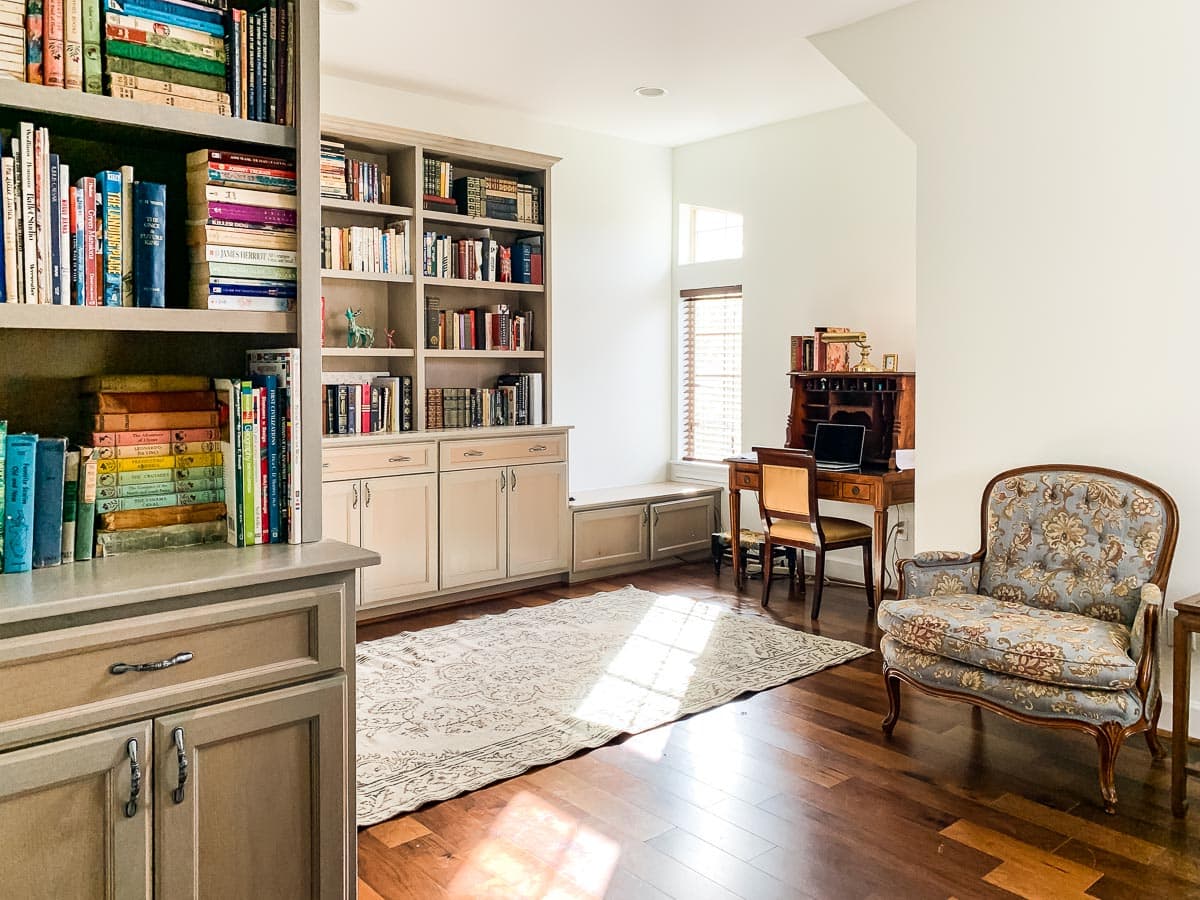
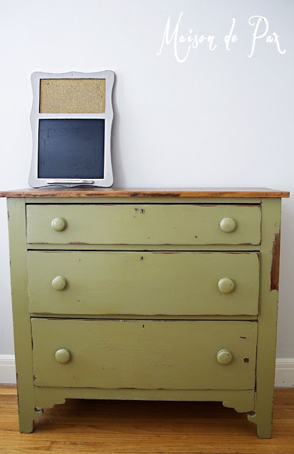
Alabaster was the Sherwin Williams Color of the Year a few years ago, and with good reason! I want to start by talking about the paint: its make up, its undertones, its strengths… Then we’ll get more specific about how to use it in real spaces with actual palettes. Note: all the images you see in the post are actually painted with SW 7008.
An Elegant Soft White
In short, Alabaster is a soft warm white (for more info on those ideas, feel free to read about my favorite white paints). Alabaster brings connotations of warmth and elegance. It is a great choice if your priority is a light interior with a touch of formality, but it can also be the perfect choice for a homey, cozy space since it is almost a cream color.
Disclaimer: I always recommend testing colors in the actual space where you intend to use them. Even after doing this job for years, I still bring paint samples into each space and watch them at different times of day before making a decision. So while Alabaster is an incredibly strong option, remember that you’ll want to consider your own space and these factors before deciding for sure.
With any color, it is important to consider its undertones to know how the paint color may change depending on lighting conditions and color pairings. And this is especially true of white paints.
SW Alabaster Undertones
Undertones are simply the colors that can appear in certain lights or when next to other colors. While Alabaster may look white at first glance, if you place it next to a true white, you will notice that it has some beige – or almost greige – undertones.
As a creamy white, Alabaster leans neither blue nor yellow but is a true warm neutral color. Often when we think of “warm,” we picture a creamy color with a hint of yellow, but Alabaster manages to be a slightly warm off-white color without yellow undertones.
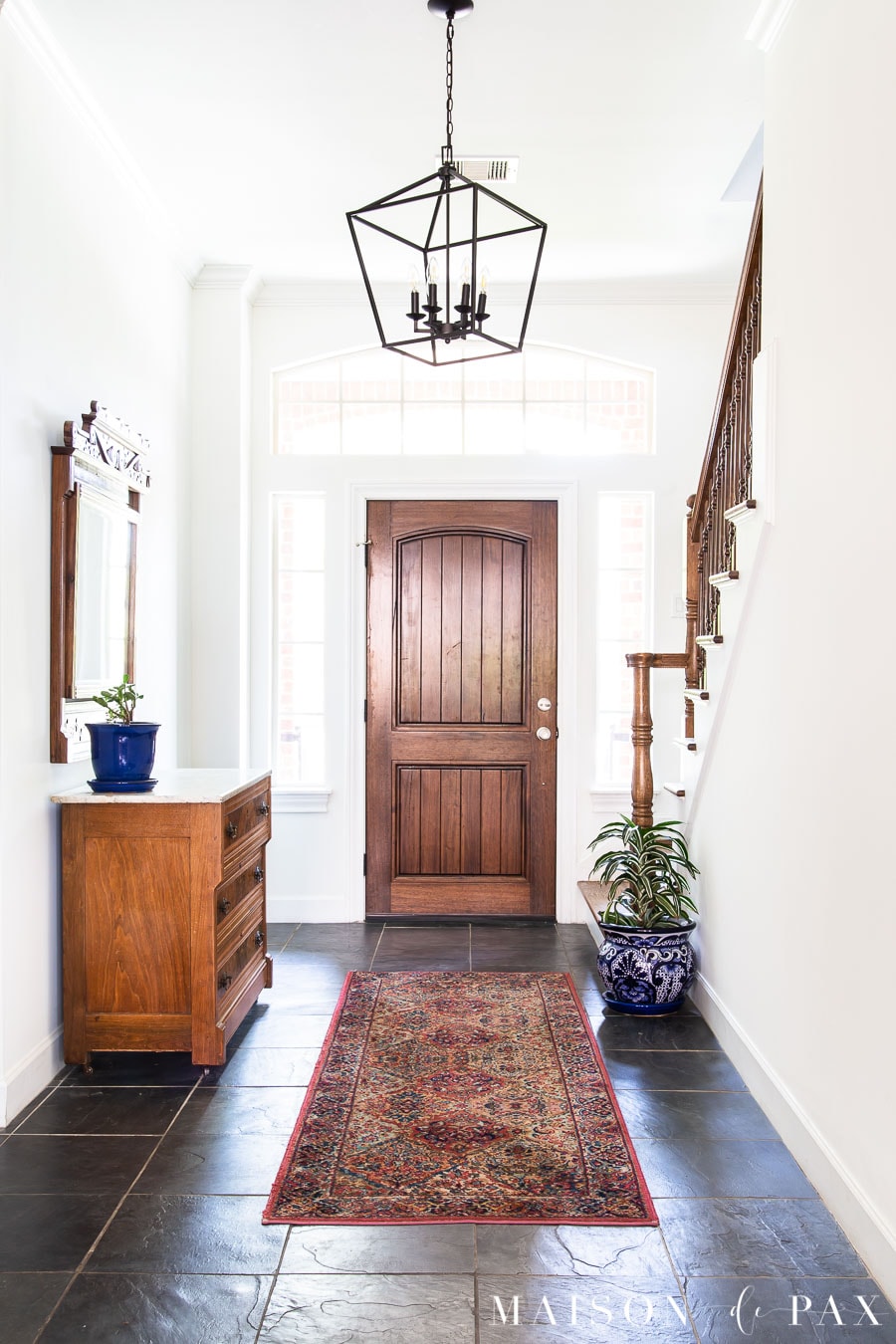
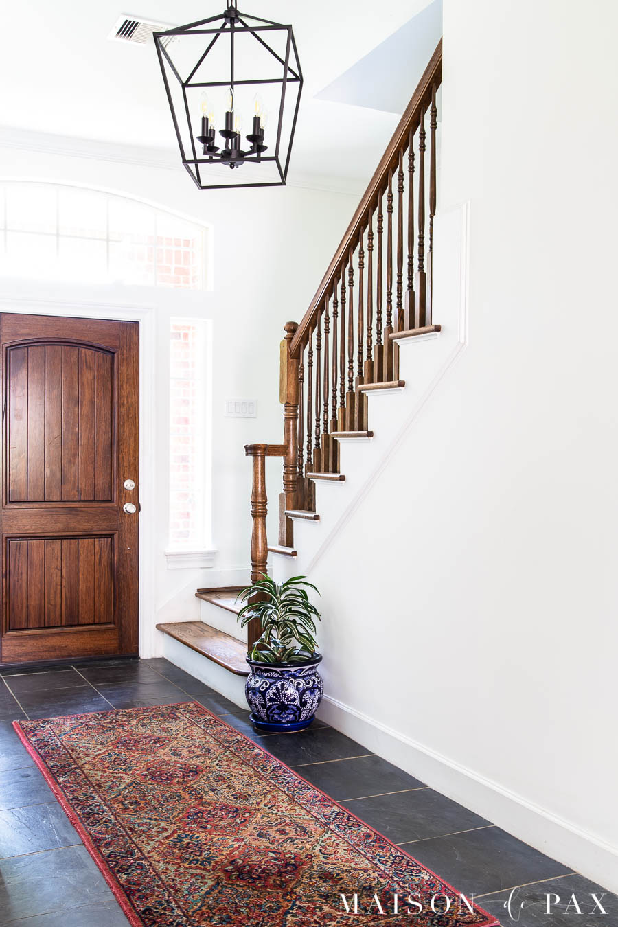
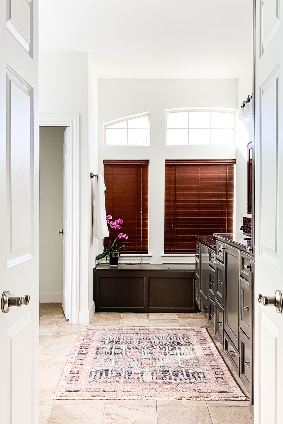
Its neutral undertones of Alabaster can leave it looking almost true white at times, especially with lots of natural light, as you can see in this north-facing room.
But here, in a south facing room at a different time of day, the shade of white looks a little softer and reflects more of the warmth of the floors.
This post contains affiliate links. Click here to read my full disclosure.
Light Reflective Value
The Light Reflective Value or LRV of any paint is a number assigned based on how much light the color reflects, with 0 being absolute black and 100 being pure white. The higher the number, the more light is reflected. Sherwin Williams Alabaster white has an LRV of 82.
For the record, no actual paint has an LRV of 100. Sherwin Williams High Reflective White (which is one of the brightest paint whites you can get) is 93. Pretty much anything 80 or above is considered white, and “off whites” can hover from ~70-80.
Alabaster’s LRV of 82 is reflective enough to be a true white while soft enough not to feel stark, even if your style is a bit more traditional or subdued.
How to test Paint Colors
As I said, testing your paint shade in your actual space, especially with whites, is so important. I’ve never had a problem with paint swatches all over my walls, but I realize that’s sometimes inconvenient. And due to challenges in getting paint samples these days, I am excited to share a better option.
Samplize will send you a reusable peel and stick samples made with real paint. It allows you to move the sample around in the room to catch the different lights. I hope you find this tool as helpful as I have!
Get your peel and stick paint samples here.
Curious about what sheen to use? See more in this post about Sherwin Williams Extra White.
Similar Colors to Alabaster
How does Alabaster fit with typical decorating styles? And how does it compare to other popular paint colors?
Alabaster v Snowbound
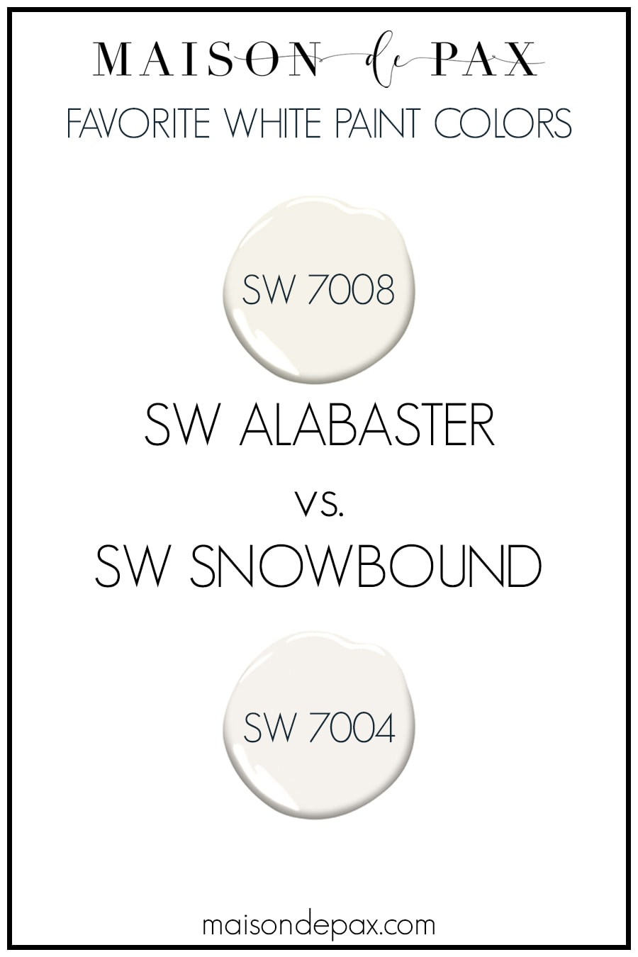
If you’ve read any of my other paint color reviews, then you know that another favorite white paint color of mine is SW Snowbound. Sometimes things are best understood by comparison, and Alabaster SW 7008 vs Snowbound SW 7004 is a perfect example. With LRVs of 82 and 83, respectively, both are soft but true whites (as opposed to “off whites”).
But Alabaster is a warmer white than Snowbound. Alabaster has more of a true beige undertone, while Snowbound has a greige undertone. If you place them beside one another, Alabaster looks creamy, while Snowbound, a more cool white, looks gray.
Typically speaking, Alabaster is a perfect backdrop for a more traditional home with a warmer aesthetic, while Snowbound is a bit more crisp and modern.
Alabaster v Pure White
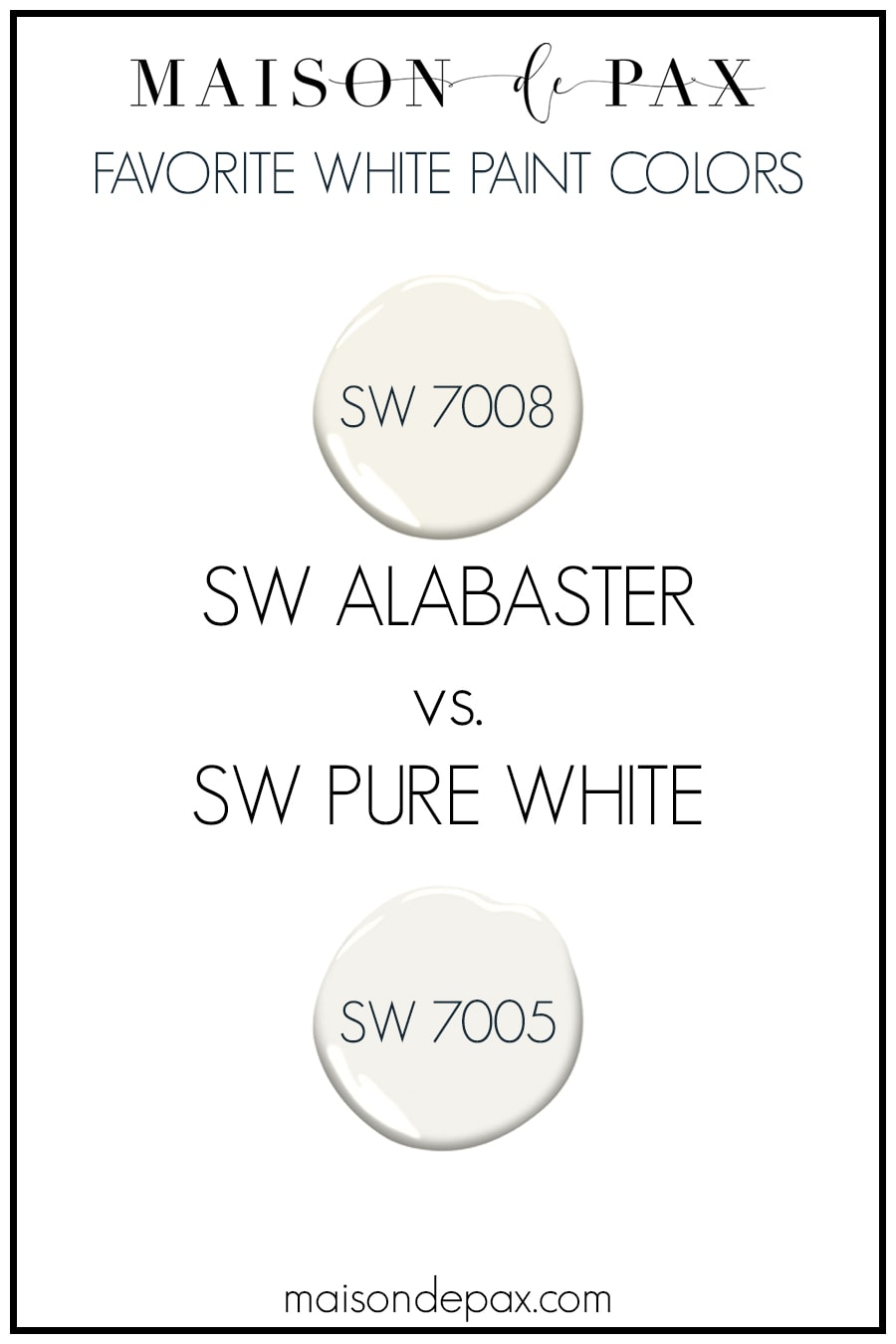
SW Pure White is an example of a paint with more similar undertones to Alabaster. Both could be described as slightly warm, soft whites, but Pure White has an LRV of 84 and is therefore brighter than Alabaster. It also is not quite a beige as Alabaster.
Alabaster v Benjamin Moore Colors
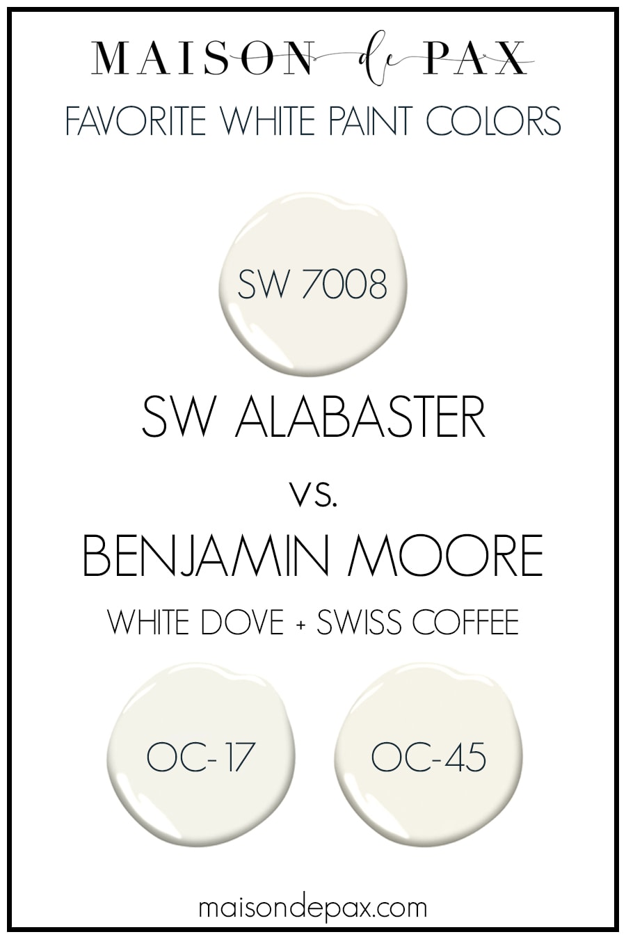
What is Benjamin Moore’s equivalent to Alabaster? Two very similar colors to Alabaster are the popular whites Benjamin Moore White Dove and Swiss Coffee. Swiss Coffee is probably the most similar to Alabaster with an LRV of 84 and a warm beige undertone. White Dove, with its LRV of 83 and a slightly more gray undertone, is a hair softer and cooler than Alabaster. Both Benjamin Moore colors are a good choice if you want a similar warm aesthetic.
What Trim Colors Go with SW Alabaster
What color cabinets with Alabaster walls? What color trim? It’s a tough question, again, because whites take on so much of the light around them. The question depends on your flooring, the direction your room faces, and so much more… But here are some principles to get you started.
Tone on Tone
Tone on tone is a very popular look in interior design right now. To achieve this, you simply use the same color for your wall paint and trim, but choose different sheens for each. Though I tend to prefer a basic white for ceilings (to bounce more light), some people even include ceilings in this look. For example, you could put flat on the ceilings, flat or eggshell on the walls, and satin or semi-gloss on the trim.
Alabaster’s soft white nature makes it a beautiful color for this option!
Alabaster walls with Pure White Trim
A classic option for Alabaster walls is Sherwin Williams Pure White trim. As mentioned above, it has similar undertones to Alabaster but is more of a true white with a higher LRV. If you like a bit of a contrast between your walls and trim but don’t want to worry about the trim being too cool, then Pure White is a great option.
Alabaster Walls with Bright White Trim
Don’t be afraid of pairing Alabaster with a brighter white trim, though. You need to be careful to test the combination in your space in case the warmer hue of the Alabaster makes your trim look blue by comparison, but bright whites such as SW Extra White or SW High Reflective White can look beautifully crisp against the soft white of SW 7008 walls.
SW Alabaster walls with Colored Trim
What colors coordinate with Alabaster? As a warm, soft white, you have the freedom to pair it with many grays or browns. I would not recommend using a cooler gray, as that could make the Alabaster look dingy, but Agreeable Gray, Accessible Beige (see this beautiful home as an example), or even Repose Gray can be a beautiful complement to Alabaster.
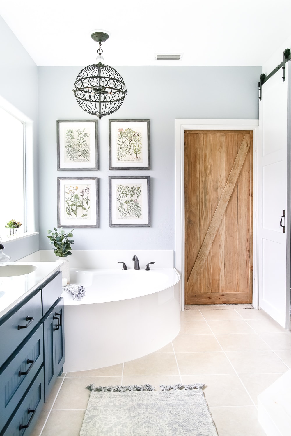
A warm gray stained wood, as you see in the living room below, also makes a beautiful accent against Alabaster walls.
For a more dramatic pairing, consider SW Cyberspace, a very dark grayish navy (seen above) or SW Urbane Bronze (below) which is a dark gray with lots of warm, brown undertones. Alabaster’s beige undertones pair beautifully with gray blues, green grays, and olive greens, as well.
Using SW Alabaster on Cabinets and Trim
For all the reasons discussed above, SW 7008 is not only a great choice for walls: family rooms, bathrooms, hallways, bedrooms, etc. It is a common choice for shiplap, trim, and kitchen cabinets, too.
If you want a more traditional or cozy farmhouse style, then you can use Alabaster on trim and cabinetry. Alabaster is not a great cabinetry or trim choice, however, if you are wanting a more contemporary or crisp look.
More Exterior and Interior Paint Color Ideas
What do you think? Are you ready to try white walls?
If you found this helpful, be sure to check out other posts in my paint color series!
- SW 7004 Snowbound in Real Spaces
- SW 7029 Agreeable Gray in Real Spaces
- SW White Duck and SW Tricorn Black Exterior Paint
- The Best White Paint Colors


Alabaster is my go-to white paint. It’s my all time favorite.
It’s such a beautiful color, isn’t it?!
I’m painting the bathroom
Alabaster semi gloss you have a what color for ceiling baseboard doors and crown molding .
We prefer SW Extra White for trim.
Just painted our kitchen cabinets, ripe olive by Sherwin-Williams. With gold accents looking for a trim color and wall color for shiplap… what do you think of the alabaster? Our countertops are a bit of an off-white with slight beige marbling as well as the back splash with a brusty gold grouting.
Alabaster would be great with those warm accent colors, but make sure it doesn’t feel too yellow with your walls. Snowbound is neutral if you need to go a bit less yellow.
Thanks so much for posting this information! Will share with my sister, who is planning to paint her entire house white, and doesn’t know where to start. I always enjoy your blog, and learn something from every one!
Debra
Glad you found it helpful!
Thanks for a very informative post. My question is the difference between SW Alabaster 7008 and BM Alabaster 876. The internet says they are not identical. I’ve never heard of anyone using BM Alabaster. 🤷♀️
I haven’t either! In my case, I used SW Alabaster.
What grey or greige pint would you pair with alablaster trim and cabinets? I will have cityscape on my island and fireplace shiplap. I’ve been all over the place from edgecomb grey, classic grey, gossamer veil, agreeable, drift of mist, city loft, worldy to Collonade….help please 😂
I’d vote for SW Agreeable Gray which is versatile warm gray!
I did narrow to gossamer, agreeable and worldly, so I really appreciate your response and expertise. I don’t think I can go wrong with agreeable. Thank you so much!
Perfect! I hope you love it.
Hello,
I loved this post. My husband and I are struggling with picking a wall color for our kitchen/living room remodel. We are using alabaster on our cabinets and trim. Our island is going to be a dark stain cabinets with Mystic springs granite on the island and Wild Dunes Shaw floors. We don’t want gray or beige and want to keep the space bright. Any ideas for colors for the walls?
Have you considered a slightly brighter white than Alabaster? I think that would be lovely.
Yes! I just don’t know which one would complement alabaster and not fight with it since it will be on cabinets and trim.
Sometimes it’s best to try a few samples! I am confident you’ll find a fresh white to use.
We are in the same situation as the original poster with the question about what white next to alabaster cabinets to use… would Pure White work or would it make the cabinets look too warm/yellow?
Thank you so much!
Hi Heather! This is definitely something you want to test before you commit.
Painting the exterior of our home in Sherwin Williams Alabaster what would be a good color to trim the house and shutters?
A warm mushroom tone would be lovely or a soft black!
Do you have any specific soft black colors you’d recommend? ?
Hi Shawna! One of my favorites is SW Tricorn Black. I also like SW Black Magic. Hope this helps!
Hey Rachel! Thank you so much for walking through the color Alabaster in such detail! We are about to paint our new home and are looking for the perfect white paint. The house has very pretty wood trim, cabinets and ceiling details plus a green/rust slate tile flooring throughout. Do you think it would look nice with that?
Yes! This paint pairs well with warmer more natural elements like wood and slate.
Great information and pics! I am trying to select wall paint color to go well with travertine floors throughout the 2006 built house. I love Pure White but worry it might be too stark for the floors – I like SW Dover White tones best when I lay the sample on the travertine floor.. but all blogs that I read say Alabaster is best with Travertine.. that Dover white may be too yellow.. I plan to paint the dark walnut cabinets white as well. The home has east – west lighting and has lots of windows in NE Florida. Do you have any feelings about travertine floors with Alabaster or Dover White painted walls?
I think they are both contenders! Give them a try with samples to be sure.
My husband and I just purchased a new home and are planning to use Alabaster for all the walls. What color do you recommend for crown molding, baseboards, and ceiling? We tried alabaster on the ceiling and it looked too yellow, but pure white looked too blue. Thank you!
Hi Elise! Another option to try is Extra White.
My daughter is going for a boho look in her room and has chosen B Summer Sunset (a terracotta orange) for her accent wall. We are having trouble finding the right neutral color for the other walls. Would you use Alabaster for this? We want it a warmer white/cream.
I’m afraid I’m not familiar with Summer Sunset, but generally speaking, Alabaster is a great option for a boho look since it has the warmth of that style without pulling too yellow. I would try samples in her space, for sure, but I think that’s a great option!
Hi! This was a very informative article, thank you! My husband and I are building our first home and I am torn on paint for the walls, trim, and cabinets. I am thinking of using Alabaster for the walls, but am debating keeping it tone on tone for the trim and cabinets too. Or use Pure White for the trim and cabinets. We have a lot of board and batten accents and we’re using lighter stained hardwood floors and white oak throughout. I’d appreciate any thoughts!
For me, the deciding factor would be if I REALLY loved Alabaster for the long-term. Painting a wall is a lot easier than changing trim. On the other hand, paint is paint and can always be redone. I have opted for white trim in my home with a warmer wall.
Hi Rachel. I am about to change the gray in my house alabaster from SW or natural tan from SW. for the ceiling, I want to do 50% strength of the same color I will buy. I have open concept and living room with at least 16 feet tall with lot of natural light. Which color of the two will you suggest? Thank you
Nafissa
Of those too options, I’d choose alabaster!
Hi Rachel,
Thank you for the very informative article.
We recently repainted our kitchen cabinets with SW 7008 Alabaster and they look great. Now we need to paint the (beige) walls with a matching color. The countertops are greyish with tones of black. I am thinking of a darker white but what would you recommend?
Thank you,
dan
I think a warmer white that is lighter than Alabaster could be a great pairing here, like Pure White.
This is so helpful. We are thinking extra white trim/doors and alabaster walls. What would you suggest for ceiling color?
I’d probably choose a flat extra white for the ceiling to keep things bright.
Hi We are doing a remodel and need to pick a white for cabinets and trim. I’m deciding between pure white and alabaster. What would you recommend between the two? I never want to paint my cabinets or trim again 😂 my house has large windows with east and west facing light. I’m stuck between these two! I’m worried alabaster might be to creamy and pure white might be to stark. Help!
I understand completely! I would definitely try it in your space to be sure, but I think that Pure White would be a safer choice; it goes with more wall color options. Alabaster is beautiful and soft, but it is less “white,” which can limit what you can put on your walls later. I hope this helps!
Great article, I am using Alabaster for my kitchen cabinets and trim. I am wanting to use Drift of Mist for the walls, but hesitant because I’m not sure that would compliment alabaster, but I want to keep it all creamy. Thoughts? Thanks!
Hi there, I’m sorry, I am not familiar with Drift of Mist. It does look like a lovely color from my quick Google search. It’s always important to test out colors in their real spaces.
My husband and I are in the middle of a re-model. I have decided to paint all the walls in our house Alabaster. We did our entire bottom floor Alabaster and it’s very versatile! I’m thinking of painting our outdated kitchen cabinets “Balanced Beige”… hear me out here (ha!) I am thinking of doing the baseboards/trim that same color (maybe I should lighten it by 50%?) What should I paint (and sheen) the crown molding and ceiling? Tell me if you think I’m crazy 😜 I have spent many night tossing and turning over this! I’ve seen the dark baseboards done with “Accessible Beige” and it looked beautiful but I do love the warmth of Balanced Beige. Thank you!
Hi Rachel – such a helpful article. Im using alabaster on exterior trim of my new home. Also on the walls with either extra white or pure white for interior trim. I don’t want white cabinets but want a light look and am considering SW sugar and cream. With the SW equivalent of cheating heart by Benjamin Moore for the island. Would alabaster go well with sugar and cream in your opinion? Lots and lots of natural light in this room. East and south walls of windows. Cabinets on the north wall. Appreciate your help!
Hi Erika! I don’t have a lot of experience with Sugar and Cream, but it looks very warm and has a lot of yellow. Luckily, Alabaster is a warm white as well, but before you commit, you should paint a poster board with those colors and compare in natural light.
Trying to choose a white for a room with north and west facing windows. We use it all times of day and want it to feel modern, cozy but not pull too yellow with the west Sun. Alabaster is at the top of my list along with creamy, origami white, greek villa. Furnishings are blacks and browns. Thoughts?? White is so hard!
Have you considered Snowbound? It looks lovely in a NW facing area and is a bit more modern.
Hi,
I’m curious what you went with and if Alabaster and Drift of Mist was a good pairing. I am planning on putting Drift of Mist on my walls and am going back and forth with Alabaster or Pure White trim!
Hi Pamela! In this space we used Alabaster— I haven’t used Drift of Mist in a whole space yet.
Would Alabaster work with black windows and black trim? The family room faces west with large sliders and windows.
Hi Rachel! This article was incredibly informative, thank you! I am planning on using Alabaster tone on tone for walls/ceilings/trim and wondered if I should keep it on trim in a dining room where we are going dark (Iron Ore) or would you recommend tone on tone in that space as well? Thank you so much!
Tone on tone in a dark color can be really sophisticated look! For a dramatic effect, I’d be tempted to try tone on tone in a space like a dining room.
Hi Rachel! I’m having a home built and the builder uses SW Natural choice on everything including the walls, trim, ceilings, and doors. The kitchen cabinets and flooring are a medium gray. Do you think if I paint the walls Alabaster and trim and doors pure white that that will look ok with the ceiling being natural choice. So expensive to paint. I just wish ceiling was already a pure white.
Typically, you want the ceiling to be lighter than the walls, but Alabaster is lighter than Natural Choice. I am not as familiar with that color so I’d test it out in a small well-lit space before you commit to the whole home.
We painted out our new build In agreeable gray. We used alabaster for the trim and the cabinets. It all looked gorgeous until the countertops were installed and now they are clashing badly. The warmth and alabaster brings out the pink tones in my counters. They are white with gray veining but now look pink. Snowbound is the better color match for the cabinets and we are looking at having them repainted. Is there any option where the cabinets could be snowbound and we could leave the trim and doors alabaster? Or does everything need to be snowbound? Also curious if you could think of an alternative cabinet color that isn’t a white that would work with agreeable gray walls, alabaster trim, and Riverway for the island. Our countertops are silestone eternal statuario. This has been it is the most stressful process and I can’t wait to solve it. Any advice would be greatly appreciated.
Thank you so much for your comment! I’m afraid I can’t offer full color consultations here, but I encourage you to try any of the colors I recommend on my blog. Best of luck with your project!
Hi! I just painted my cabinets Alabaster. I have a lot of natural light and they are appearing more white than i wanted! What color can i paint my walls and trim for the cabinets to look more creamy! Thanks!
Natural light can really lighten any reflective surface. I haven’t used this option, but SW Natural Choice might be a good fit!
If you paint your trim color alabaster to match the walls do you still paint the ceiling white? Do you think painting the trim to match is a trendy look that will fade away after a few years and might be safer to stick with white trim? Thanks 🙂
Hi there! Painting them the same sheen seems to be a trend, but yet, it’s super common in European classic design.
Hi,
I am hoping you can see my comment and respond 🙂 I am painting my house with alabaster as the main color. We are thinking about pure white as trims, and ceiling. Do you think that’s a good idea? Also we are also going with agreeable gray as an accent color in all bedroom. Please help. Thank you
Those are all beautiful options! Be sure to select flat for your ceiling finish. I prefer eggshell for walls and satin for trim/cabinetry. How do you plan to use the Agreeable Gray as an accent color?
Hi Rachel!
We love how the Alabaster color brightens up our space with dark wood floors and beige travertine tiles. We plan to pain the walls in matte and trims in semigloss. Would it be better to pain the ceiling in the same color in flat or a different color like extra white?
If trims are being painted in alabaster as well, would all doors be painted the same color?
Trying to figure out how to make this look nice. Thank you!
Alabaster in flat is a great choice, as long as you have nice lighting.
I’m painting my loft and living room which is a very bright area SW Alabaster and thinking of SW Pure White for trim, will Alabaster look yellowish due to the brightness of room?
It totally depends on the color of the sunlight. A western sun may highlight the yellow warmth of Alabaster, but a cool light won’t.
Thank you, we get an eastern morning through early afternoon sun
I’d recommend sampling it on the wall and viewing it in different lights. I know Alabaster can look really yellow in western sun!
Greetings,
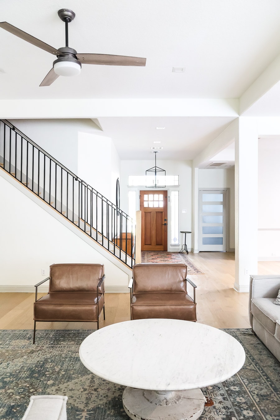
Curious what brand style are the wood doors / colors in the first two images? Love both the solid and window entry doors.
I’m afraid I wasn’t a part of helping either homeowner choose those doors, so I don’t have a source for you. Sorry about that!
Thanks! I found the door styles. in case anyone is interested the first one is a 2 Panel V-Groove Arch Top Exterior Door that come in many colors. The second one is a craftsman 8 lite.
This was very informative. I have Accessible Beige walls but want to try something different with my kitchen. I want to paint my island Tricorn Black and my cabinets Alabaster but I afraid that I will mess things up. Do you have any color suggestion’s?
I have done something similar in an older kitchen: Agreeable Gray walls, factory white cabinets, and factory gray lowers. I think I’d also explore White Dove, but both Alabaster and White Dove will work with the warmth of AB.
Hello,
New house, considering painting cabinets, trim, ceiling, and doors SW Extra White, walls SW Alabaster, and kitchen island SW tri-corn black — thoughts? (Actually the modular home came with extra white trim, doors, and subway tiles, so too the paint colors were
based on this, to save money). Living room windows are east facing but partially blocked by grove of trees; kitchen patio door mostly western exposure but will get some south sun midday. Have not moved in yet but house is on the farm. Thanks kindly.
I think all of that sounds great! Just make sure you are happy with the warmth of Alabaster because it can feel yellow in some spaces. I do still love it.
I painted my whole house Alabaster and love it! We did Pure White Trim. We are about to remodel our kitchen,and I am having a hard time deciding on the white for them. I am between going with Alabaster too or Dover White. What do you suggest? My floors are dark wood floors.
Is this for the cabinets?
Great write up. Question regarding paint.. Installing an Ikea axstad kitchen in white with frosty Carrina quartz with brass hardware. I do have orange ish oak floor.
Plan on using 3500k lights, kitchen facing east, would Alabaster wall/ pure white trim& ceiling work??
Thanks in advance!
Hi Jacob!
East could feel really warm, almost yellow, during the earlier parts of the day. It depends on how much light you are receiving. In this instance, I think you should paint a swatch and test to see whether you like it in the light. If you prefer really creamy paint color, even with the warmth of the sunlight, then it could be a good choice.
Thank you! Ordered some samplize in cloud white and simply white as well. Looking at doing wall paint + ceiling the same and doing doors and trim chanteilly lace Which would you prefer between cloud white / simply white BM for an east room with orangish oak floor?
Hi! I feel likes simply white is more versatile, but always test it to see how it cooperates with Chantilly Lace (a bright white!)
Hello; I am struggling to pick a white for my small beach condo. The interior receives minimal light during the day but has a beautiful soft sunset glow in the evening. I was planning on Pure White for cabinets. The living and kitchen areas are connected. I was thinking of Alabaster or Greek Villa for all walls and Pure White for the trim. My quartz is Seaglass, mostly white and I have blue and white tiles. My furniture is light linen. Any thoughts? This is so hard to pick out! Thank you!
Alabaster and Greek Villa are beautiful, but very warm colors. They can feel yellow with a warm sun’s glow. It could work, as long as you like the warmth during those evening hours.
Painting north facing stucco exterior house, debating between SW Alibaster or SW Pure White, the trim will be SW white & have a galvanized tin roof. Want a creamy white but don’t want it to look yellow. Front of house will have dark stained cedar shutters & posts & either black or dark wood door with black accents on porch. Which color would use or what color would you suggest we sample other than my choices above.
Thank you in advance.
Exterior whites feel brighter with exterior light! Another couple options to explore are BM Swiss Coffee and SW Sea Pearl. Both feel creamy, without feeling yellow.