Eclectic Traditional Gallery Wall
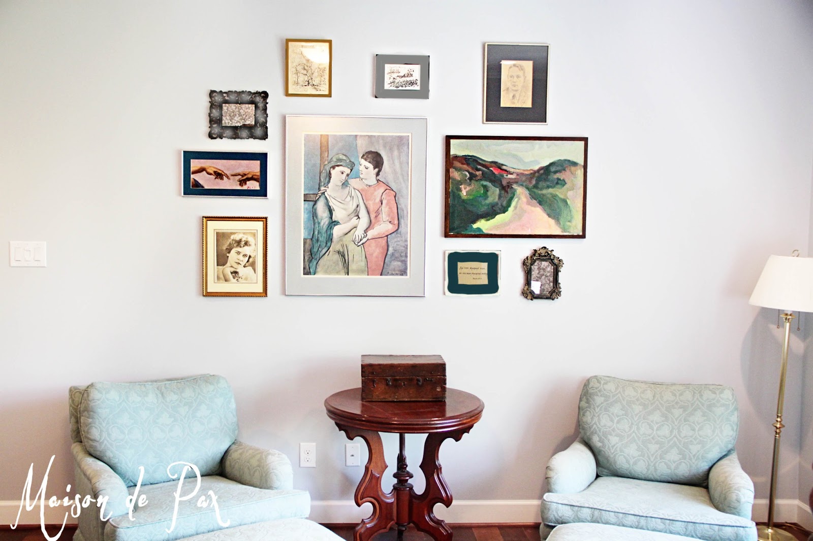
It’s not finished yet, but I wanted to share a recent project with you all. I spent one afternoon last week putting together this eclectic yet traditional gallery wall for my parents, using old photographs, black and white sketches, oil paintings, and mirrors in a variety of frames.

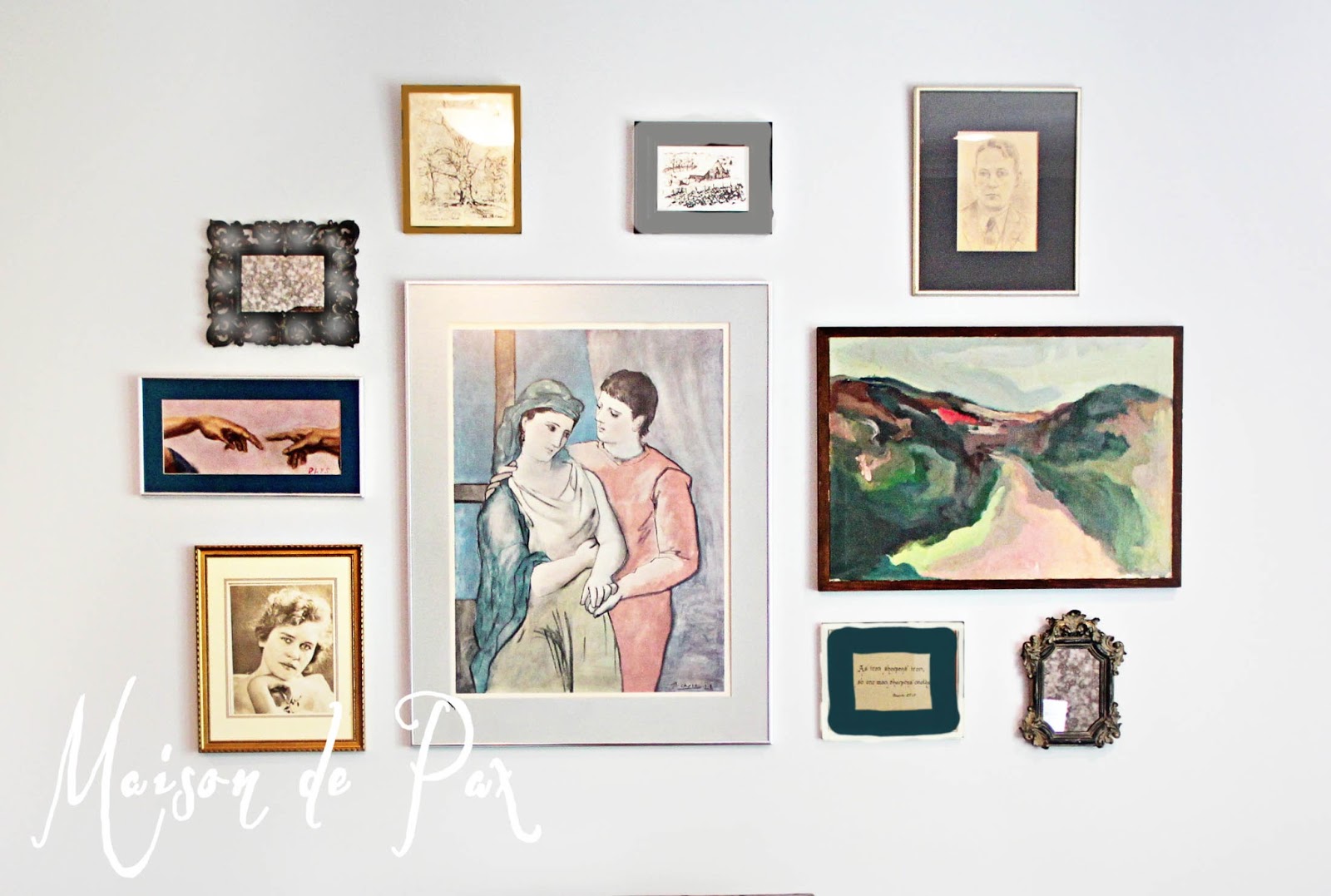
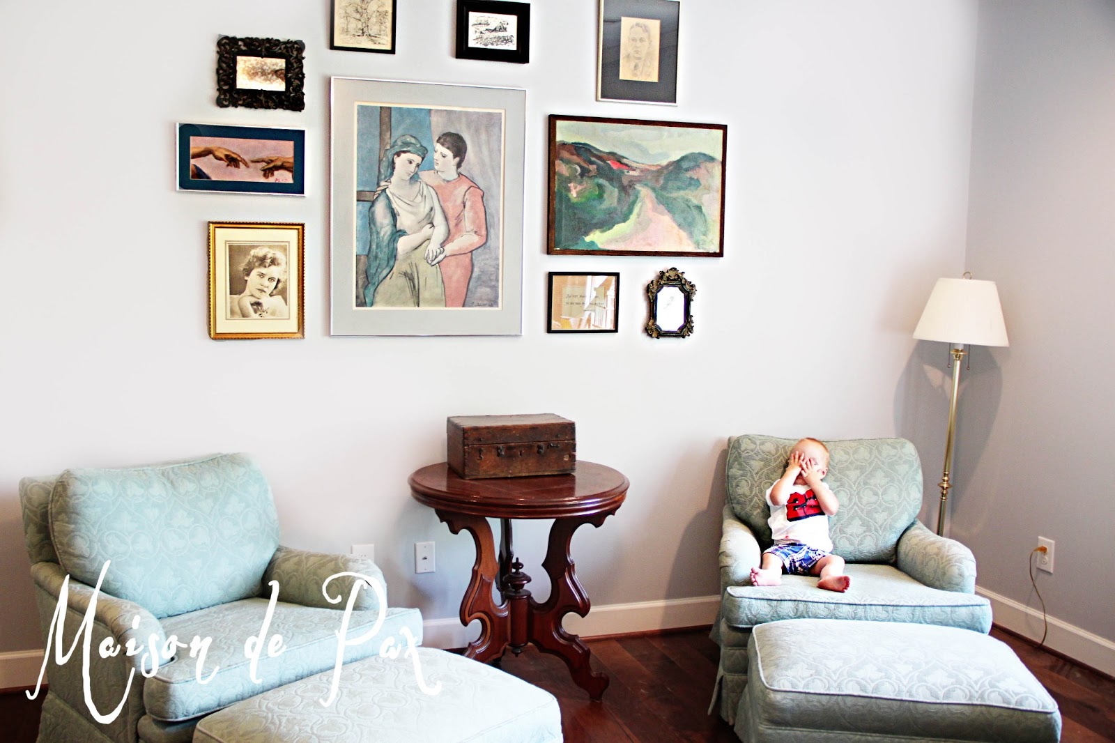
Did you recognize something there? That’s right, framing the Picasso print is the gray mat I painted and shared with you earlier this week. I originally thought a new frame would be needed, as well, but I really like the simple, silver frame as part of this gallery wall.
My parents have the most eclectic and yet traditional taste of anyone I know. They have antique, distressed, chippy trunks layered with pristine, carved victorian tables (like the one you see above). They have lots of rich, natural wood furniture (some of which my father built!) mixed with antique Indian pottery and rugs. They both have a natural inclination towards blue-grays (as seen above), but my mom really loves a splash of bright color. Overall, though, they don’t seem to want to stray too far from the traditional scene, so it poses a nice challenge to highlight their eclectic (and fabulous!) stuff without going too far outside the box.
The club chairs (which are so comfortable and beautifully upholstered) are not really their top color choice (just because neither of them is a “green” person), but since they are not in the market to reupholster them now, my goal was to draw them into the blue/gray color scheme of the room using pictures and frames they already had.
What do you think of the arrangement?

I think a few of the frames (namely the black ones, as there is no other black in the whole room) need some tweaking, but I wanted to get the basic geometry done before I began painting. So I brought my pictures home and played in Photoshop a bit. I’m thinking something like this:
To do:
-gild the upper left black frame
-soften the ornate frame just below and to the left with a light glaze (maybe with a hint of silver?)
-medium gray for the one to the right of the gilded frame
-light frame with a deep blue/turquoise mat for the calligraphy quote near the bottom right
I like how the yellowed antique photos and drawings bring in some warm colors, and I like the subtle gold in a few of the frames to offset an otherwise very cool room. Here it is close up (I know, I know, my photoshop skills are amazing, right?!?! Sarcasm fully intended!):
I feel I should note that the gallery is ~8′ wide and 5′ tall. It doesn’t look nearly as big in a picture, does it? Anyway, I was pleased with the result, despite how difficult it was to get any pictures for you all without a little one bombing the photo!
I love working with what I have and trying to re-envision it. I think I love even more doing it for someone else since it involves the added element of trying to exemplify their taste rather than my own… I love a good challenge. 😉 I’ll be sure to share the final product when I’m done!
How about you? What gallery wall successes (or lessons learned!) do you have?